Archive for the ‘Geek’ Category

Do The Math; It Isn’t That Difficult

Wednesday, January 21st, 2009

I got this email from several people a while back; you may have seen it too:

This makes sense to me…read and see if you agree…

OK…..here’s a plan I could live with. I’m against the $85,000,000,000.00 bailout of AIG. Instead, I’m in favor of giving $85,000,000,000 to America in a “We Deserve It Dividend”.

To make the math simple, let’s assume there are 200,000,000 bonafide U.S. Citizens over 18. Our population is about 301,000,000 +/- counting every man, woman and child. So 200,000,000 might be a fair stab at adults 18 and up.

So divide 200 million adults 18+ into $85 billon that equals $425,000.00. My plan is to give $425,000 to every person 18+ as a “We Deserve It Dividend”.

Of course, it would NOT be tax free. So let’s assume a tax rate of 30%. Every individual 18+ has to pay $127,500.00 in taxes. That sends $25,500,000,000 right back to Uncle Sam. But it means that every adult 18+ has $297,500.00 in their pocket. A husband and wife team has $595,000.00.

What would you do with $297,500.00 to $595,000.00 in your family? Pay off your mortgage – housing crisis solved. Repay college loans – what a great boost to new grads. Put away money for college – it’ll be there. Save in a bank — create money to loan to entrepreneurs. Buy a new car — create jobs. Invest in the market — capital drives growth. Pay for your parent’s medical insurance — health care improves. Enable Deadbeat Dads to come clean — or else. Remember this is for every adult U S Citizen 18+ including the folks who lost their jobs at Lehman Brothers and every other company that is cutting back and, of course, for those serving in our Armed Forces.

If we’re going to re-distribute wealth let’s really do it… instead of trickling out a puny $1000.00 (‘vote buy’) economic incentive that is being proposed by one of our candidates for President. If we’re going to do an $85 billion bailout, let’s bail out every adult U S Citizen 18+!

As for AIG — liquidate it. Sell off its parts. Let American General go back to being American General. Sell off the real estate. Let the private sector bargain hunters cut it up and clean it up. Here’s my rationale. We deserve it and AIG doesn’t.

Sure it’s a crazy idea that can ‘never work.’ But can you imagine the Coast-To-Coast Block Party! How do you spell Economic Boom?

I trust my fellow adult Americans to know how to use the $85 Billion “We Deserve It Dividend” more than do the geniuses at AIG or in Washington DC.

And remember, the plan only really costs $59.5 Billion because $25.5 Billion is returned instantly in taxes to Uncle Sam.

What do you think?

What do I think? I think someone needs to check the math. Dividing $85 Billion amongst 200 million people yields $425.00, not 1,000 times that. I think somebody put the decimal point in the wrong place.

You know, passing an email like this along is understandable — on its face it sounds pretty good, and because it sounds good, certainly whoever originally wrote it had a calculator or computer or something to check the figures, so it must be right, right?

The funny thing was this; not long after seeing that message, a talk radio host brought it up on the air. Someone else on the show later pointed out that he might want to check the math; he said he tried, but his calculator couldn’t hold that many digits! I’m not a betting man, but I’d bet a large amount of money that he had a computer on his desk with a copy of Excel installed. And in the unlikely case that he didn’t have Excel, he most certainly has a calculator that was installed along with the OS. Surely people know that software tools can do the same thing as a desk calculator, only better; don’t they?

That made me think of something that has bugged me for a long time; how many people have a computer on their desk, and a desk calculator right next to it? Every operating system I’ve seen installs a calculator application by default. That calculator is far more capable than most any desk calculator; that combined with the fact that most desktop computers have full-size keyboards with numeric pads, why would anyone want a desk calculator? I don’t know about you, but my desk is cluttered enough without adding another gadget to it. I’ve used nothing but the calculator in the computer since, oh, about 1993. What’s so difficult about it?

I think it goes back to the age-old problem that people are basically technophobic, and they learn only what they think they need to know to do their jobs. It’s a rare individual who will stretch beyond what they need to know to understand the capabilities of the tools their employers provide. But since so many are averse to change of any kind, I guess I can’t expect too much.

Review — NuShield AG™

Tuesday, January 13th, 2009

My apologies to those who have been asking for this follow-up review; it’s been a long time coming. Since I wrote about the new iMac that was purchased for work and the trouble with it’s glossy screen (link), it’s been a crazy busy time at work with a major system upgrade, followed closely by the Christmas & New Year holidays, and trouble getting decent photos of the film installed on the iMac (and I’m still not happy with what I’ve got…) Now, finally, the planets seem to be in alignment and everything is coming together; if only I could sit down for more than a five minute stretch to finish this…

I ordered two NuShield AG™ Antiglare Screen Protectors for 24″ iMacs ($35 each) and one for my G4 PowerBook — it was inexpensive ($15) and I thought it might help avoid the scuff marks the keyboard was leaving on the original. They all arrived in a sturdy cardboard tube a week or so later, and I installed the film on my PowerBook that day, and the iMac the next day. The PowerBook went pretty smoothly; clean the ‘Book’s screen, clean the NuShield, pop the sides under the edges of the display bezel, and you’re done. The iMac? A little more involved.

The display fronts on the new-generation iMacs are flush with the aluminum case, so the NuShield film, as packaged for the iMac, is basically a rectangular sheet of their antiglare material with narrow adhesive strips around the perimeter that holds it in place. It’s cut to the same width as the display area on the front of the iMac, but the height is just a little shorter than the display to keep it from obscuring the iSight lens at the top-center of the screen. Of course the documentation accompanying the film says nothing about where it should be positioned, so it took a few tries to get it aligned just right. The CSI team would have no trouble figuring out who installed it; my fingerprints are all over that stickyback.

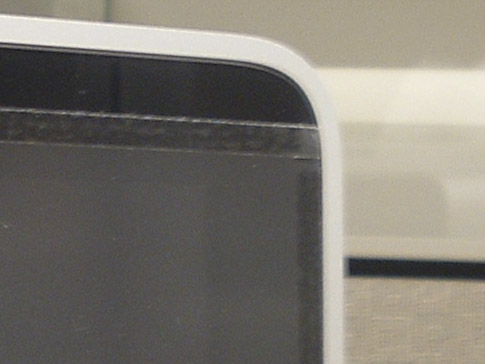
The fit & finish of the installed product was less than impressive. When examined up close it looks exactly like what it is — a piece of film tacked to the display. From a distance it looks fine, but up close the edges of the film stand out against the glossy black of the display frame, and the adhesive strips are easily seen. The corners are cut square, and at the bottom the corners extend past the black frame to overlap onto the aluminum case. You’d think it’d be an easy matter to match the radius of the display’s corners at the bottom; that would give it a more finished look.

After all the futzing around trying to get the thing on straight, I’m still not totally convinced that the sheet is cut square; no matter how I tried, I couldn’t get it quite straight. The edges still look like they’re not parallel with the adjacent display edges. After several attempts, I gave up & left it at somewhat of a happy medium that I’m not terribly happy with. But then again, I’m not looking at it 8 hours a day either.

Getting it positioned was about as easy as making sure that it & the screen on the iMac were dust free; as in, not very. I have to admit that I handicapped the process a little, as this particular user isn’t known for her housekeeping abilities and I didn’t take the time to clean the area first. It’s necessary to lay the sheet out flat during the installation, and any little speck of dust gets sucked right to the static-filled film. Note to self: if ever installing one of these again, make sure the desk and surrounding area are thoroughly cleaned first. And if I’d been thinking, I would’ve borrowed some dust elimination tools from our platemaking area; they used a roller with a slightly tacky surface to remove dust from plates, film and the vacuum exposure unit before exposing. That was all before we purchased a digital plate imager, but the roller is still around. That would’ve worked a treat for this! Next time. Yes, next time.

But once the film was installed, it did do a decent job of reducing the glare produced by the standard office lighting. Personally, I wasn’t too bothered by the glare, but the user for whom this iMac is home was bothered, and I haven’t heard a peep from her since installing the NuShield regarding glare, so that’s one measure of success.

There is a side effect produced by the film that is a bit bothersome; to reduce the glare, the NuShield film has a bit of a graininess to it — I suppose it’s the grainy surface that breaks up the reflections that would otherwise appear as glare to the user. But when the grainy surface is against the glossy front of the iMac, it produces a moiré-like pattern. Unfortunately, photographing this pattern is beyond the limited abilities of my equipment and me, so I can’t really show it well. But the graininess of the film and display’s pixels work together to make strange patterns on the screen. The severity of the pattern seems to vary according to the color on the display and how busy a pattern is displayed. To me, personally, this issue is more of a nuisance than the glare. But again, the user doesn’t seem to mind it at all. So for this particular installation, it does the job.

All in all, if the glare produced on your new iMac is an issue, the NuShield is an ok option. Not wonderful, but adequate. Were the glossy-screen iMac my primary computer, the glare would need to be pretty bad to make me want to install this product; the attachment method and moiré-like pattern produced by the film are big negatives to me, and the need for glare reduction would need to be pretty dire to offset those negatives. But again, that’s just me. A couple of small things NuShield could do to improve the product…

  1. … put a radius on the bottom corners of the film to match the display. I suppose I could do that myself, but…
  2. … the installation instructions that came with the film were pretty generic and didn’t cover the adhesive method used on the iMac at all; lots of room for improvement there.

The dearth of instructions specific to the iMac gives me the feeling that this is fairly new territory for NuShield. At least I hope that’s the case.

Since that first article I purchased and installed a second 24″ iMac with the glossy screen — I ordered the second NuShield knowing this purchase was coming up. However the guy using the second iMac isn’t bothered by the glare, so the film is still in its container. I’ll probably hang onto it in case we get another iMac that needs de-glossing.

Two Things That Bug Me…

Tuesday, January 13th, 2009

Not to complain, but there are some elements of some websites that make me just a little crazy sometimes…

One of them is the “Close Window” button you sometimes see. I just saw it on a window that popped up when I clicked on a link to view an enlarged image of a product at a retailer’s website. It’s a normal window, one that could be closed by clicking on the X (or the red dot) in the top corner of the window, or by a Ctrl-W (or Command-W) keyboard command, or even clicking to FileClose Window. But no; some web designer in his/her wisdom thought it would be a good idea to a button that can be clicked that will do it for you. It’s usually just one of those things I ignore, but for some reason(?) I clicked on that button today and got an alert from IE (on Windows XP):

How stupid is that? I can see how IE would maybe want to alert the user that something in the web page was trying to trigger something in the application, but why would closing the page be a concern? Shouldn’t the app be aware that it was a user’s mouseclick that initiated what was going on? Aside from that, just the presence of that button means that someone somewhere thinks that people using a computer aren’t smart enough to figure out that closing the window that just popped up involves clicking on the same user interface element as closing any other window. Excuse me, but it’s not exactly rocket science.

The second thing that bugs me is when a website displays an image that is either click-able or has a link nearby to view an enlarged image, and when clicked you get the same image with no enlargement in a different window. I realize that most of the times this happens is when a retailer gets its product images from a vendor, they only get one size — small — and the pages are automatically built from a template. But would it really that difficult to code so that nothing happens if there isn’t a larger image available? Or that no link is generated in the first place?

Probably not much of an issue with a faster computer and connection, but still, how annoying; if a site shows a tiny product image and I want to take a closer look, when the page tells me to click here for a closer look, I’d like to get a closer look. Is that too much to ask?

Ok. I feel a little better now.

The Virtual KVM Redux

Sunday, November 23rd, 2008

A post I wrote earlier this year, The Virtual KVM, has one of the highest page rankings on the site. That isn’t really saying much, but the fact that someone hits that page about every other day presumably looking for help in setting up a virtual kvm on two or more computers, and they end up here tells me that there isn’t a lot of information on the web to guide people through the process.

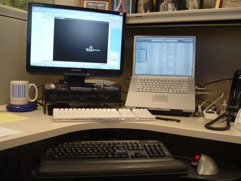
The virtual kvm is a software solution that allows the keyboard & mouse on one computer to control another (so it’s actually just a virtual kv, but who’s counting?) I use it on my desk at work; the desktop PC — an Athlon-powered Lenovo running Windows XP — is on the left, with the keyboard & mouse connected to it, and the PowerBook is on the right. I push the cursor to the right side of the PC’s screen and it jumps over to the Mac’s screen, and any keyboard or mouse input is transferred there. Almost like magic!

work_desk.jpg

Synergy is one of the more popular bits of software for getting the job done, but in its native form, it lacks a lot in the way of user-friendliness. When I first set things up, I found QuickSynergy was an easy way to get the two machines talking to each other. And all was great. Great that is until I upgraded the OS on the Mac to 10.5.

Not sure what it was, but something in 10.5 broke QuickSynergy. Every time it launched, it would hang and finally crash. I wasted a morning trying to get it to work, and nothing seemed to help, so I thought I’d take another stab at setting up Synergy on the Mac side. I couldn’t get it to work the first time, but I should be able to pull it off this time.

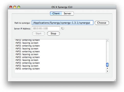
Before I had a chance to even download it, I bumped into OS X Synergy GUI, another open source app that works with Synergy, making configuration a whole lot easier. It’s not quite as pretty or polished as QuickSynergy — and it could sure use a custom icon — but it works, so I’m glad I was forced to look again.

Provided you’ve got Synergy running on the server side, getting it to work is pretty simple:

  • Download the Mac Synergy client/server package and decompress it,
  • Download the OS X Synergy GUI package and decompress it,
  • Launch the GUI,
  • Point it to the Synergy client app,
  • Enter the IP address of the server,
  • Click Start.
  • The server portion in the GUI hasn’t been implemented just yet, but the client is what I need, and it works great; even better than QuickSynergy. It connects quickly, and even has a nifty info window that tells you every time the mouse enters or leaves the screen, and any other issue that it thinks you need to know about.

    You can quit the app if you like; the synergyc process continues to run and keeps things connected. The only issue I’ve found with quitting the GUI is that when I close the PowerBook and go home, when I open it up in the morning it doesn’t always connect. I then have to go into Activity Monitor, track down the process and kill it, then open GUI again and restart it. Much easier to keep GUI running, then hit the Stop button when I disconnect, and start it up again in the morning.

    (more…)

    A Neat Cheat in Illustrator

    Wednesday, November 19th, 2008

    I discovered a neat but little-known trick in Adobe Illustrator

    At work customers often provide pdf files as “artwork”; no originating files, supporting files, or fonts. In most cases we can take that pdf, import it into ArtPro, and outline the fonts, but it’s sometimes a hassle. And there are times when I’m at home and would like to do that for a project too. And what about someone who doesn’t have ArtPro or Nexus… What’s a graphics geek to do?

    A properly created pdf will have all the needed fonts embedded within the file. Acrobat can open and correctly render the fonts because Acrobat can make use of the embedded fonts. But if you open that same pdf in Illustrator, those embedded fonts are useless, and when the fonts aren’t loaded on the system, Illustrator substitutes the fonts in the file with whatever it has on hand, and text goes all over the place. Totally unacceptable.

    But here’s a neat trick to get around that.

  • Launch Illustrator and create a new document,
  • Place the pdf file in the document you just created,
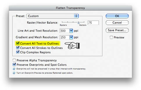
  • With the placed pdf selected, pull down in the Object menu to Flatten Transparency,
  • In the Flatten Transparency dialog box, make sure that Convert All Text To Outlines is checked,
    Hit OK.

    That placed pdf file then gets converted to native Illustrator objects, with all of the text in the pdf file converted to outlines. Even the quirky font that you’ve never seen before becomes an editable filled path in Illustrator. If you intend to keep the content from the pdf in Illustrator, it’s likely that some of the objects may need a little tweaking, especially if the pdf file originated in QuarkXPress. When I’ve done this, gradients built with spot colors in Quark come out as numerous solid color CMYK boxes with a clipping path. Not so neat, but easily remedied.

    For the record, I’ve tried this in Illustrator CS3 (v.13) and CS2 (v.12); not sure how far back it goes, but I’m guessing that it should work on any version that supports transparency; I think that was introduced in version 7 or 8. I haven’t upgraded to CS4 just yet (good God; already?!) so I don’t know for sure if it still works there, but chances are it does. It probably also works on the same products on the Windows side, but I’ve not tested it there either. YMMV.

    Have fun with it!

  • My RJ-45 Zipper Pull Mod

    Tuesday, November 18th, 2008

    Last spring, the zipper pull broke on my light jacket. I used a paper clip as a temporary replacement, but that looked pretty nerdy. I wore it last week, and felt a bit self-conscious about it, and was careful to keep the clip hidden while out & about, and was thinking seriously about replacing it. After all, it was getting to be several years old, and not exactly the peak of winter fashion.

    But last Friday I walked in the front door carrying my tool bag, I had a sudden burst of inspiration; why not use a bit of wire and an RJ-45 plug for the zipper pull? It’d be the perfect geek accessory on the jacket!

    So here is the final result. I’ll call it Version 1.

    It was pretty simple, really; I took a length of Cat. 5 cable about 4 inches long, pulled the twisted pairs out of it and threaded two pairs through the business end of the zipper. I then doubled the wires back, straightened them out — being careful to arrange the colored wires in an aesthetically-pleasing manner — and clipped them off about 2 inches from the zipper. Then the RJ-45 went on the end and got crimped down, and there you have it!

    The same thing could be done with an RJ-11 plug and a single twisted pair, but the RJ-45 allows for two pairs, and presumably double the strength.

    A couple of afterthoughts about this mod upon completion; a much cleaner installation could be achieved by slipping some Cat. 5 cable jacket or heat-shrink tubing over the wire before crimping the connector in place… Just enough to fit in between the zipper and the crimp. As it is, the small amount of exposed wire doesn’t really present the effect I was hoping for. Another option would be to use solid color wire, and the same color on all four strands. That would allow the color to be coordinated with the jacket, giving a more pleasing color combination. Or maybe just wrap some black electrical tape around the exposed wires… It’d be nice to have a molded end on the plug, but that’d probably involve a used cable as most of those are molded with the cable in place. There you’d have to do some kind of twisting and/or soldering on the backside of the zipper to keep it in place. But then again I have seen some patch cables that have hoods that aren’t molded in place and could be slid onto the thing; I’ll have to keep my eye out for one of those for Version 2.

    Animusic Pipe Dreams

    Sunday, November 2nd, 2008

    Miss C. posted this video on her site over the weekend, referring to it as, “An oldie that never gets old”. Well, it may be old in Internet terms (2006) but I’d never seen it before, and it’s truly worth watching. And it turns out the animators — Animusic — has put out two videos with similar content. Too cool!

    Watching it, I can’t help but appreciate the time and thought that had to go into this piece… I’m sure the animators started with the music, and then worked backward to synchronize the balls striking the instruments, then figured out where the balls would go afterward. The timing, the creative use of percussion, the movement through the 3D space… Very, very cool. Had to be done in animation, cuz it would never, ever work in real life. You’d have extra noise from the balls rattling through the PVC and balls flying everywhere; no way could you aim balls coming out of a common tube to strike instruments in different locations. But I guess that’s where the name comes from!

    Never mind my geeking over the details; just enjoy!

    Windows Rant Of The Day — Finding A File Path

    Tuesday, September 30th, 2008

    Here’s one place where the Macintosh really, really shines compared to Windows…

    Let’s say you have a document open in Word or Excel or PowerPoint, on either platform. Like many users, you just fired up the app and opened it through the handy-dandy Recent Documents list, just like you’ve done daily since you originated that document a month or so ago. And like many users you have no clue where on your hard drive you saved that particular file. But now, Gertrude in the next cubicle, or Hector in the Mexico City office, needs a copy of that file… How do you figure out where to find it?

    On the Mac, just hold down the Command (Apple) key and click on the document title bar. A menu showing every step in the file path drops down. Pull down and click in any step in that menu, and you’re taken to that directory/folder. While it’s not exactly intuitive — you probably won’t find that trick in any of the Office apps’ menus — it’s easy as can be once you know it. Once you see the file, you can copy it to a flash drive, drag it to an email message, burn it to a CD, or whatever.

    If you’re on a PC, well, it’s a different story. Emailing the file is pretty straightforward; click on the Office Button (in Office 2007) then pull down to Send — Email. That still doesn’t tell you where you can find the file, but Microsoft dumbs down that process enough to make it work. But what if you really need to burn that file to a CD or copy it to a thumb drive… how do you track down the location of the file?

    Not sure if this is the best way, but after much digging around in the Office 2007 menus, what I found is that you can click on the Office Button (in Office 2007) then pull down to Prepare — Properties; that opens up a Document Properties bar just below The Ribbon, which includes a Location: field that shows the full file path for the file. From there you can select & copy the path, then paste it into an Explorer window. Yeah. That’s intuitive.

    These examples refer to the Microsoft Office suite in both the Mac OS and in Windows; the same trick works in all apps on the Mac because it’s part of the OS. In Windows… the same trick will likely take different steps in different apps. That’s just the way it works in Winders.

    And once again, the Mac OS smacks the snot out of Windows.

    My Moller AirCar — A Dream Realized, Sort Of…

    Friday, September 19th, 2008

    I can remember drooling over the Moller SkyCar since the first time I saw renderings of it on the pages of Popular Science or Popular Mechanics decades ago. The thought of being able to hop into a machine that would lift off from your own driveway and zip you to your destination at speeds around 300 mph, far above traffic… What a wonderful thing that would be! A vehicle that is able to perform like a high-performance airplane, but as easy to drive as a car.

    Yesterday evening I at long last took possession of a Moller M400 SkyCar. It’s true! You would think my joy would be complete, but given the fact that what I’ve got is only a toy…

    Yes, it’s just a HotWings diecast model of the SkyCar. Not very fulfilling, but still not a bad deal for $1.98 at Target!

    The dream that is the Moller SkyCar remains just that; a dream. Since the idea was first introduced, the SkyCar’s inventor, Paul Moller, has failed to deliver a single working prototype of the SkyCar. That combined with Moller’s readiness to accept deposits from hopeful SkyCar buyers has led to accusations that the whole thing is a scam. Moller seems to put out a press release and make a big splash every now & then, which some say coincided with a need to generate some cash or deflect heat he’s getting from investors or government regulators. Part of me believes that to be true, but the more likely case is that Paul Moller is simply trying very hard to make his dream come true — he just doesn’t have the where-with-all to make it happen. The really unfortunate part is that he’s spent somewhere in the neighborhood of $200 million in the process, much of that coming from those hopeful investors, who won’t likely live to see any fruit from their investment.

    The company is publicly traded, and while looking at their trading info I was surprised to see a recent Yahoo Finance story on Moller dated just a few days back; apparently the company is “in the process of completing its fourth M200 “Jetson” volantor airframe. It expects to complete forty of these fly-by-wire, multi-engine flying vehicles in 2009.” The M200 is vastly different from the M400 SkyCar; it more closely resembles a flying saucer, using multiple ducted fans around the single seat to provide lift and directional thrust vectoring. The M200G is limited to ground-effect flight at a mere 10 feet above the ground. (after a little more digging, the Yahoo story seems to be a rehash of a press release that got much broader coverage back in July. Nothing new.)

    The design of the SkyCar seems to have morphed a bit over the years; the rotating ducted fan nacelles on stubby wings you see on the early renderings and on the diecast toy seem have been replaced by what looks to be fixed nacelles with thrust vectoring vanes, no forward wing, and a much larger rear wing. Some images I’ve seen show the rear wing folding up and over the rear engines, probably so it can fit in a garage (suppressed chortle).

    The SkyCar always has been a really, really cool idea, but I’m afraid the technology to make it work just hasn’t arrived yet. Engines powerful enough to get a vehicle, passengers & payload off the ground are too heavy to make something like the SkyCar practical, and fuel will I won’t get to fully realize my dream, but maybe my kids, or their kids, will.

    Further Reading:
    Davis Wiki Moller Page
    Wikipedia M400 SkyCar Article
    Official Moller Website