Archive for the ‘Computers’ Category

Apple & Dell

Tuesday, August 25th, 2009

Pretty much, Apple and Dell are the only ones in this industry making money. They (Dell) make it by being Wal-Mart. We make it by innovation.


Steve Jobs.

This quote was found at a site I bumped into tonight; Minimal Mac. A little heavy on the hoity-toity Mac user stereotype, but they’ve got some good info.

Yet Another Reason To Dislike Windows?

Thursday, August 20th, 2009

I titled this post as a question, because I’m not sure if I’m missing something or what; please fill me in if I am. Here’s the story:

Today at work I had a Windows XP Pro machine suddenly decide that the automatic login was too convenient; it’s attached to a piece of inspection equipment, and the manufacturer set it up to be on its own domain and log in automatically. But when it was booted up today it decided it needed to have a password. And nobody knew the password.

I was able to guess the password after a few tries (they’re so predictable), but the question then became, how the heck do I re-enable the automatic login? The users on this machine really didn’t want to have to mess around with a password, so I poked around for a while in the Control Panel & Help system, but didn’t find any answers. I resorted to checking Microsoft’s knowledgebase, and found this gem of a solution:

  1. Click Start, click Run, type regedit, and then click OK.
  2. Locate the following registry key:
    • HKEY_LOCAL_MACHINE\SOFTWARE\Microsoft\Windows NT\CurrentVersion\Winlogon
  3. Using your account name and password, double-click the DefaultUserName entry, type your user name, and then click OK.
  4. Double-click the DefaultPassword entry, type your password under the value data box, and then click OK.

    If there is no DefaultPassword value, create the value. To do this, follow these steps:

    1. In Registry Editor, click Edit, click New, and then click String Value.
    2. Type DefaultPassword as the value name, and then press ENTER.
    3. Double-click the newly created key, and then type your password in the Value Data box.

    If no DefaultPassword string is specified, Windows XP automatically changes the value of the AutoAdminLogon registry key from 1 (true) to 0 (false) to turn off the AutoAdminLogon feature.

  5. Double-click the AutoAdminLogon entry, type 1 in the Value Data box, and then click OK.

    If there is no AutoAdminLogon entry, create the entry. To do this, follow these steps:

    1. In Registry Editor, click Edit, click New, and then click String Value.
    2. Type AutoAdminLogon as the value name, and then press ENTER.
    3. Double-click the newly created key, and then type 1 in the Value Data box.
  6. Quit Registry Editor.
  7. Click Start, click Restart, and then click OK.

Cool. Edit the registry to re-enable the auto-login. Genius. And that isn’t even touching the reason why it got disabled in the first place. Isn’t there an easier way to do this? For crying out loud…

Contrast that with Mac OS X (10.5.7 to be exact)…

  1. Click the Apple Menu, pull down to System Preferences, & click on Accounts,
  2. Flip the Automatic login: from Disabled to the login account you want to use, and enter the password when prompted.
  3. Go about your work, getting things done.

Now isn’t that a lot easier?

Digital Music Pads

Saturday, May 9th, 2009

Here’s something quite cool; the Freehand Systems MusicPad Pro Plus. It’s essentially a Linux-powered keyboardless tablet PC that specializes in displaying music files. It uses a back-lit color LCD touch screen to display the music files that you load onto it by connecting it up to a Mac or PC. It can use music that you scan from sheet music, music files you buy & download from Freehand’s website, or transfer from an app like Sibelius.

The MusicPad Pro essentially replaces the sheet music a musician would use during a rehearsal or performance. It can hold an entire library’s worth of music, and if the user is playing outdoors there is no worry about having sheet music flying around in the wind. The user can also write notes on the music displayed on the MusicPad Pro and save those notes with the music. It’s a great concept, but at the price of $899, probably a little out of reach of most musicians and performing groups.

While I can’t take credit for this concept, it does remind me of something I thought up and sketched out while sitting through one of the kids’ band concerts years ago. I was bored out of my gourd (is it right to say that?) and my mind started wandering, thinking about all the work that goes into organizing sheet music for a band or orchestra; the conductor has the full score and most every player has a different set, and that’s duplicated for every piece the group plays. Just trying to wrap my head around the system needed to track all that paper makes me dizzy.

So I thought, what if the conductor had the music stored on a central computer — the server — with its display at the podium? And what if each musician had a wireless display — the client — that linked into that central computer & received the music from it? The musicians could tap a button on the screen or click a foot pedal to advance to the next page, or have the music scroll up as the piece progresses. For a stage performance, a tablet-sized screen would be great for the musicians, but when the cost of a display is usually keyed to the size of the screen, how about shrinking the screen down to the size of a recipe card — 3 x 5 inches — and attached directly to the instrument? I remember my older sisters using something like that for marching band back in the ’70’s, and the coronet that I used in junior high has an attachment that allows for that. With the display closer to the user’s eyes it doesn’t need to be very big (just look at the popularity of watching movies on iPods and other handheld devices.)

The difficulty I guess would be keeping the server & client pads coordinated through a performance… There are lots of things that could go wrong, and with a system like this, and going wrong in the middle of a performance… it would be ugly. Actually the real difficulty is in getting the concept to actually work in the real world, and to be able to sell it at an affordable price. The $900 MusicPad Pro is a great device, but it’s overkill for most bands and orchestras, and at that price just isn’t accessible to most primary & secondary schools and private organizations. An exhaustive three minute Google search shows that other than a few software solutions (like Music Reader) that can be run on a Windows or Mac computer, the Freehand device is pretty much the only game in town for digital music pads right now, so I think there’s potential for a system like this to really do well.

But the practicalities of the system won’t be my worry because I don’t know where to even start bringing an idea like this into reality, so I’ll leave the gritty details to someone more capable. I doubt I’m the first person to think of something like this.

Progress Bars Gone Wild!

Wednesday, February 18th, 2009

One more thing that drives me crazy; progress bars that don’t give a realistic indication of your progress.

Case in point; today I was doing some maintenance on one of the laptops at work, and part of that was updating Adobe Acrobat Standard on an HP laptop running Windows XP Pro. It downloaded the 8.1.3 updater and proceeded to apply the update.

First, a larger status box came up and showed the status bar progressing quickly from left to right. But when the bar got all the way to the right, it just started over again. Over, and over, and over, and over…

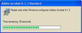
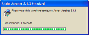
Then after a while, a smaller dialog box came up showing a slower moving progress bar, plus a “Time Remaining:” line; at first it showed 2 minutes, then about five minutes later it dropped to 1 minute.

Then about 10 minutes later it dropped to 50 seconds. And then about 5 minutes later it’s down to 1 second remaining.

And all the while the larger status bar is zipping right along, zip! zip! zip! zip! Hmmm. Not a confidence builder.

Finally, after about 20 minutes it throws up a dialog box saying it needs to restart the computer to complete the install. Good thing; I thought perhaps I’d been transported into something akin to the Groundhog Day story.

Windows Rant Of The Day — Outlook

Wednesday, January 21st, 2009

I’ve been using Microsoft Entourage — part of the Office for Mac suite — as my primary email client since about, oh, 1995 or so; it’s the one product out of Redmond that really made start to think that Microsoft products might not be so bad. But there seems to be a world of difference between Microsoft for Mac products and those for Windows, because Outlook — Entourage’s counterpart on the Windows side — isn’t nearly as refined.

I’m supporting Windows users pretty much full-time at work these days, so I figured I’d better use the software they use, to force myself to learn the ins & outs of it so I’m better able to answer the questions that come up. In the process of switching over to the Dark Side (yes, The Dark Side), I’m finding Outlook 2007 to be a huge disappointment. That probably shouldn’t be a surprise to me.

There are many things I don’t care for in Outlook, but one thing that really frosted my cookies a while back was trying to create a distribution list… In Entourage, it’s as easy as can be; you select the names in your address book that you’d like to add, create a new distribution list — or Group, as they’re called in Entourage — and POOF, your newly-created group is already populated with the contacts you had selected. What could be easier?

What could be easier? Certainly not Outlook… To create a Distribution List (DL) in Outlook, there is no possible way — at least none that I was able to find — for a selection in your Contacts list to be carried over to a new DL. None. Drag & drop doesn’t even work. The only way to add members to a DL is to tell Outlook to create the DL then click Select Members and scroll through the list to find the email addresses you want to add. (Notice I didn’t say you need to find the Contact you wanted to add; the only selection you can make is by email address; more on that a little later.) Sure you can use the dialog to narrow down the list, or search for a particular string in the Contacts list, but puts severe limits on your search.

For example, I wanted to create a DL that had email addresses from a particular domain. In the Contacts list you can use the Search Contacts field to narrow down the visible items to those that match what you type there; type in the domain name and your list is whittled down to those contacts containing email or web page addresses that match. But there is no way to get that into a DL! That flippin’ drives me crazy.

I think part of the reason that Entourage can pull off a trick so neatly when the same thing makes Outlook puke all over itself is that in an Entourage Address Book entry you can have a pile of email addresses for a given entry, but one of those addresses is set as the Default. That way you can select a bunch of contacts and it knows which address to use when you load them into a Group. Outlook… just don’t work that way. And that’s too bad.

I guess this is just another example of the left hand not knowing what the right hand is doing. Or an example of Microsoft being fat & lazy, not caring to make things easier for their user base.

Do The Math; It Isn’t That Difficult

Wednesday, January 21st, 2009

I got this email from several people a while back; you may have seen it too:

This makes sense to me…read and see if you agree…

OK…..here’s a plan I could live with. I’m against the $85,000,000,000.00 bailout of AIG. Instead, I’m in favor of giving $85,000,000,000 to America in a “We Deserve It Dividend”.

To make the math simple, let’s assume there are 200,000,000 bonafide U.S. Citizens over 18. Our population is about 301,000,000 +/- counting every man, woman and child. So 200,000,000 might be a fair stab at adults 18 and up.

So divide 200 million adults 18+ into $85 billon that equals $425,000.00. My plan is to give $425,000 to every person 18+ as a “We Deserve It Dividend”.

Of course, it would NOT be tax free. So let’s assume a tax rate of 30%. Every individual 18+ has to pay $127,500.00 in taxes. That sends $25,500,000,000 right back to Uncle Sam. But it means that every adult 18+ has $297,500.00 in their pocket. A husband and wife team has $595,000.00.

What would you do with $297,500.00 to $595,000.00 in your family? Pay off your mortgage – housing crisis solved. Repay college loans – what a great boost to new grads. Put away money for college – it’ll be there. Save in a bank — create money to loan to entrepreneurs. Buy a new car — create jobs. Invest in the market — capital drives growth. Pay for your parent’s medical insurance — health care improves. Enable Deadbeat Dads to come clean — or else. Remember this is for every adult U S Citizen 18+ including the folks who lost their jobs at Lehman Brothers and every other company that is cutting back and, of course, for those serving in our Armed Forces.

If we’re going to re-distribute wealth let’s really do it… instead of trickling out a puny $1000.00 (‘vote buy’) economic incentive that is being proposed by one of our candidates for President. If we’re going to do an $85 billion bailout, let’s bail out every adult U S Citizen 18+!

As for AIG — liquidate it. Sell off its parts. Let American General go back to being American General. Sell off the real estate. Let the private sector bargain hunters cut it up and clean it up. Here’s my rationale. We deserve it and AIG doesn’t.

Sure it’s a crazy idea that can ‘never work.’ But can you imagine the Coast-To-Coast Block Party! How do you spell Economic Boom?

I trust my fellow adult Americans to know how to use the $85 Billion “We Deserve It Dividend” more than do the geniuses at AIG or in Washington DC.

And remember, the plan only really costs $59.5 Billion because $25.5 Billion is returned instantly in taxes to Uncle Sam.

What do you think?

What do I think? I think someone needs to check the math. Dividing $85 Billion amongst 200 million people yields $425.00, not 1,000 times that. I think somebody put the decimal point in the wrong place.

You know, passing an email like this along is understandable — on its face it sounds pretty good, and because it sounds good, certainly whoever originally wrote it had a calculator or computer or something to check the figures, so it must be right, right?

The funny thing was this; not long after seeing that message, a talk radio host brought it up on the air. Someone else on the show later pointed out that he might want to check the math; he said he tried, but his calculator couldn’t hold that many digits! I’m not a betting man, but I’d bet a large amount of money that he had a computer on his desk with a copy of Excel installed. And in the unlikely case that he didn’t have Excel, he most certainly has a calculator that was installed along with the OS. Surely people know that software tools can do the same thing as a desk calculator, only better; don’t they?

That made me think of something that has bugged me for a long time; how many people have a computer on their desk, and a desk calculator right next to it? Every operating system I’ve seen installs a calculator application by default. That calculator is far more capable than most any desk calculator; that combined with the fact that most desktop computers have full-size keyboards with numeric pads, why would anyone want a desk calculator? I don’t know about you, but my desk is cluttered enough without adding another gadget to it. I’ve used nothing but the calculator in the computer since, oh, about 1993. What’s so difficult about it?

I think it goes back to the age-old problem that people are basically technophobic, and they learn only what they think they need to know to do their jobs. It’s a rare individual who will stretch beyond what they need to know to understand the capabilities of the tools their employers provide. But since so many are averse to change of any kind, I guess I can’t expect too much.

Review — NuShield AG™

Tuesday, January 13th, 2009

My apologies to those who have been asking for this follow-up review; it’s been a long time coming. Since I wrote about the new iMac that was purchased for work and the trouble with it’s glossy screen (link), it’s been a crazy busy time at work with a major system upgrade, followed closely by the Christmas & New Year holidays, and trouble getting decent photos of the film installed on the iMac (and I’m still not happy with what I’ve got…) Now, finally, the planets seem to be in alignment and everything is coming together; if only I could sit down for more than a five minute stretch to finish this…

I ordered two NuShield AG™ Antiglare Screen Protectors for 24″ iMacs ($35 each) and one for my G4 PowerBook — it was inexpensive ($15) and I thought it might help avoid the scuff marks the keyboard was leaving on the original. They all arrived in a sturdy cardboard tube a week or so later, and I installed the film on my PowerBook that day, and the iMac the next day. The PowerBook went pretty smoothly; clean the ‘Book’s screen, clean the NuShield, pop the sides under the edges of the display bezel, and you’re done. The iMac? A little more involved.

The display fronts on the new-generation iMacs are flush with the aluminum case, so the NuShield film, as packaged for the iMac, is basically a rectangular sheet of their antiglare material with narrow adhesive strips around the perimeter that holds it in place. It’s cut to the same width as the display area on the front of the iMac, but the height is just a little shorter than the display to keep it from obscuring the iSight lens at the top-center of the screen. Of course the documentation accompanying the film says nothing about where it should be positioned, so it took a few tries to get it aligned just right. The CSI team would have no trouble figuring out who installed it; my fingerprints are all over that stickyback.
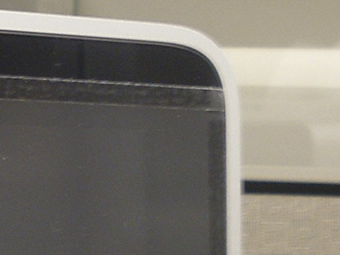
The fit & finish of the installed product was less than impressive. When examined up close it looks exactly like what it is — a piece of film tacked to the display. From a distance it looks fine, but up close the edges of the film stand out against the glossy black of the display frame, and the adhesive strips are easily seen. The corners are cut square, and at the bottom the corners extend past the black frame to overlap onto the aluminum case. You’d think it’d be an easy matter to match the radius of the display’s corners at the bottom; that would give it a more finished look.

After all the futzing around trying to get the thing on straight, I’m still not totally convinced that the sheet is cut square; no matter how I tried, I couldn’t get it quite straight. The edges still look like they’re not parallel with the adjacent display edges. After several attempts, I gave up & left it at somewhat of a happy medium that I’m not terribly happy with. But then again, I’m not looking at it 8 hours a day either.

Getting it positioned was about as easy as making sure that it & the screen on the iMac were dust free; as in, not very. I have to admit that I handicapped the process a little, as this particular user isn’t known for her housekeeping abilities and I didn’t take the time to clean the area first. It’s necessary to lay the sheet out flat during the installation, and any little speck of dust gets sucked right to the static-filled film. Note to self: if ever installing one of these again, make sure the desk and surrounding area are thoroughly cleaned first. And if I’d been thinking, I would’ve borrowed some dust elimination tools from our platemaking area; they used a roller with a slightly tacky surface to remove dust from plates, film and the vacuum exposure unit before exposing. That was all before we purchased a digital plate imager, but the roller is still around. That would’ve worked a treat for this! Next time. Yes, next time.

But once the film was installed, it did do a decent job of reducing the glare produced by the standard office lighting. Personally, I wasn’t too bothered by the glare, but the user for whom this iMac is home was bothered, and I haven’t heard a peep from her since installing the NuShield regarding glare, so that’s one measure of success.

There is a side effect produced by the film that is a bit bothersome; to reduce the glare, the NuShield film has a bit of a graininess to it — I suppose it’s the grainy surface that breaks up the reflections that would otherwise appear as glare to the user. But when the grainy surface is against the glossy front of the iMac, it produces a moiré-like pattern. Unfortunately, photographing this pattern is beyond the limited abilities of my equipment and me, so I can’t really show it well. But the graininess of the film and display’s pixels work together to make strange patterns on the screen. The severity of the pattern seems to vary according to the color on the display and how busy a pattern is displayed. To me, personally, this issue is more of a nuisance than the glare. But again, the user doesn’t seem to mind it at all. So for this particular installation, it does the job.

All in all, if the glare produced on your new iMac is an issue, the NuShield is an ok option. Not wonderful, but adequate. Were the glossy-screen iMac my primary computer, the glare would need to be pretty bad to make me want to install this product; the attachment method and moiré-like pattern produced by the film are big negatives to me, and the need for glare reduction would need to be pretty dire to offset those negatives. But again, that’s just me. A couple of small things NuShield could do to improve the product…

  1. … put a radius on the bottom corners of the film to match the display. I suppose I could do that myself, but…
  2. … the installation instructions that came with the film were pretty generic and didn’t cover the adhesive method used on the iMac at all; lots of room for improvement there.

The dearth of instructions specific to the iMac gives me the feeling that this is fairly new territory for NuShield. At least I hope that’s the case.

Since that first article I purchased and installed a second 24″ iMac with the glossy screen — I ordered the second NuShield knowing this purchase was coming up. However the guy using the second iMac isn’t bothered by the glare, so the film is still in its container. I’ll probably hang onto it in case we get another iMac that needs de-glossing.

Two Things That Bug Me…

Tuesday, January 13th, 2009

Not to complain, but there are some elements of some websites that make me just a little crazy sometimes…

One of them is the “Close Window” button you sometimes see. I just saw it on a window that popped up when I clicked on a link to view an enlarged image of a product at a retailer’s website. It’s a normal window, one that could be closed by clicking on the X (or the red dot) in the top corner of the window, or by a Ctrl-W (or Command-W) keyboard command, or even clicking to FileClose Window. But no; some web designer in his/her wisdom thought it would be a good idea to a button that can be clicked that will do it for you. It’s usually just one of those things I ignore, but for some reason(?) I clicked on that button today and got an alert from IE (on Windows XP):

How stupid is that? I can see how IE would maybe want to alert the user that something in the web page was trying to trigger something in the application, but why would closing the page be a concern? Shouldn’t the app be aware that it was a user’s mouseclick that initiated what was going on? Aside from that, just the presence of that button means that someone somewhere thinks that people using a computer aren’t smart enough to figure out that closing the window that just popped up involves clicking on the same user interface element as closing any other window. Excuse me, but it’s not exactly rocket science.

The second thing that bugs me is when a website displays an image that is either click-able or has a link nearby to view an enlarged image, and when clicked you get the same image with no enlargement in a different window. I realize that most of the times this happens is when a retailer gets its product images from a vendor, they only get one size — small — and the pages are automatically built from a template. But would it really that difficult to code so that nothing happens if there isn’t a larger image available? Or that no link is generated in the first place?

Probably not much of an issue with a faster computer and connection, but still, how annoying; if a site shows a tiny product image and I want to take a closer look, when the page tells me to click here for a closer look, I’d like to get a closer look. Is that too much to ask?

Ok. I feel a little better now.

The Virtual KVM Redux

Sunday, November 23rd, 2008

A post I wrote earlier this year, The Virtual KVM, has one of the highest page rankings on the site. That isn’t really saying much, but the fact that someone hits that page about every other day presumably looking for help in setting up a virtual kvm on two or more computers, and they end up here tells me that there isn’t a lot of information on the web to guide people through the process.

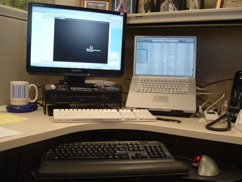
The virtual kvm is a software solution that allows the keyboard & mouse on one computer to control another (so it’s actually just a virtual kv, but who’s counting?) I use it on my desk at work; the desktop PC — an Athlon-powered Lenovo running Windows XP — is on the left, with the keyboard & mouse connected to it, and the PowerBook is on the right. I push the cursor to the right side of the PC’s screen and it jumps over to the Mac’s screen, and any keyboard or mouse input is transferred there. Almost like magic!

work_desk.jpg

Synergy is one of the more popular bits of software for getting the job done, but in its native form, it lacks a lot in the way of user-friendliness. When I first set things up, I found QuickSynergy was an easy way to get the two machines talking to each other. And all was great. Great that is until I upgraded the OS on the Mac to 10.5.

Not sure what it was, but something in 10.5 broke QuickSynergy. Every time it launched, it would hang and finally crash. I wasted a morning trying to get it to work, and nothing seemed to help, so I thought I’d take another stab at setting up Synergy on the Mac side. I couldn’t get it to work the first time, but I should be able to pull it off this time.

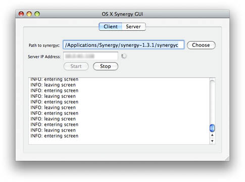
Before I had a chance to even download it, I bumped into OS X Synergy GUI, another open source app that works with Synergy, making configuration a whole lot easier. It’s not quite as pretty or polished as QuickSynergy — and it could sure use a custom icon — but it works, so I’m glad I was forced to look again.

Provided you’ve got Synergy running on the server side, getting it to work is pretty simple:

  • Download the Mac Synergy client/server package and decompress it,
  • Download the OS X Synergy GUI package and decompress it,
  • Launch the GUI,
  • Point it to the Synergy client app,
  • Enter the IP address of the server,
  • Click Start.
  • The server portion in the GUI hasn’t been implemented just yet, but the client is what I need, and it works great; even better than QuickSynergy. It connects quickly, and even has a nifty info window that tells you every time the mouse enters or leaves the screen, and any other issue that it thinks you need to know about.

    You can quit the app if you like; the synergyc process continues to run and keeps things connected. The only issue I’ve found with quitting the GUI is that when I close the PowerBook and go home, when I open it up in the morning it doesn’t always connect. I then have to go into Activity Monitor, track down the process and kill it, then open GUI again and restart it. Much easier to keep GUI running, then hit the Stop button when I disconnect, and start it up again in the morning.

    (more…)

    A Neat Cheat in Illustrator

    Wednesday, November 19th, 2008

    I discovered a neat but little-known trick in Adobe Illustrator

    At work customers often provide pdf files as “artwork”; no originating files, supporting files, or fonts. In most cases we can take that pdf, import it into ArtPro, and outline the fonts, but it’s sometimes a hassle. And there are times when I’m at home and would like to do that for a project too. And what about someone who doesn’t have ArtPro or Nexus… What’s a graphics geek to do?

    A properly created pdf will have all the needed fonts embedded within the file. Acrobat can open and correctly render the fonts because Acrobat can make use of the embedded fonts. But if you open that same pdf in Illustrator, those embedded fonts are useless, and when the fonts aren’t loaded on the system, Illustrator substitutes the fonts in the file with whatever it has on hand, and text goes all over the place. Totally unacceptable.

    But here’s a neat trick to get around that.

  • Launch Illustrator and create a new document,
  • Place the pdf file in the document you just created,
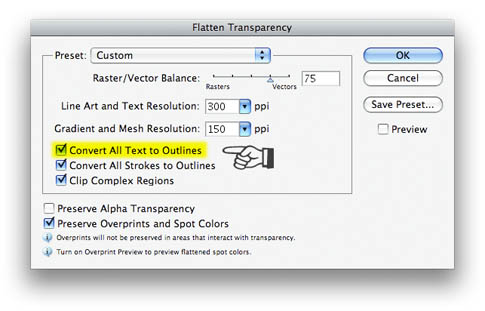
  • With the placed pdf selected, pull down in the Object menu to Flatten Transparency,
  • In the Flatten Transparency dialog box, make sure that Convert All Text To Outlines is checked,
    Hit OK.

    That placed pdf file then gets converted to native Illustrator objects, with all of the text in the pdf file converted to outlines. Even the quirky font that you’ve never seen before becomes an editable filled path in Illustrator. If you intend to keep the content from the pdf in Illustrator, it’s likely that some of the objects may need a little tweaking, especially if the pdf file originated in QuarkXPress. When I’ve done this, gradients built with spot colors in Quark come out as numerous solid color CMYK boxes with a clipping path. Not so neat, but easily remedied.

    For the record, I’ve tried this in Illustrator CS3 (v.13) and CS2 (v.12); not sure how far back it goes, but I’m guessing that it should work on any version that supports transparency; I think that was introduced in version 7 or 8. I haven’t upgraded to CS4 just yet (good God; already?!) so I don’t know for sure if it still works there, but chances are it does. It probably also works on the same products on the Windows side, but I’ve not tested it there either. YMMV.

    Have fun with it!